Rochdale Development Agency rebranding
A process of evolution rather than revolution
To celebrate their 25th anniversary, the Rochdale Development Agency (RDA) decided it would be a good time to rebrand their identity with an updated logo design. I was asked to consider all options from a simple tweak through to a completely new identity. To further complicate the process Rochdale Borough had commissioned a new identity that was intended for use by all the combined local authority organisations. It was decided that the new RDA rebranding should fit in with the Borough branding. However, the RDA wanted to keep a degree of autonomy, so the new logo would be able to stand alone when used in isolation.
A number of creative concepts were produced. Some completely different, and some a little more subtle. The original logo shown below features a capital letter ‘R’ at an angle with the inner section of the semi-circle raised and filled with red.
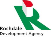
The old RDA logo
Designing a new logo
Continuing with the capital letter theme, I explored the possibility of introducing all three initials into the new logo. Through a process of refinement and adaptation, I removed the cross bar on the letter ‘A’ and slanted it, so that when it was placed under the capital letter ‘D’ the two then formed a capital letter ‘R’. One of those rare instances where everything works out well!
The colours and fonts in the new logo are from the Borough identity. This really helps when the RDA logo is seen along side, or in tandem with other organisations featuring the same colour palette.
The next stage was to add the accompanying text. The previous logo was difficult to place in documents due to its backwards slanting format and left ranging text. A number of logo versions were then produced to allow the logo to be shown reversed out of darker colours and in smaller sizes. I even produced a vertical stacked option for use when width is a problem.
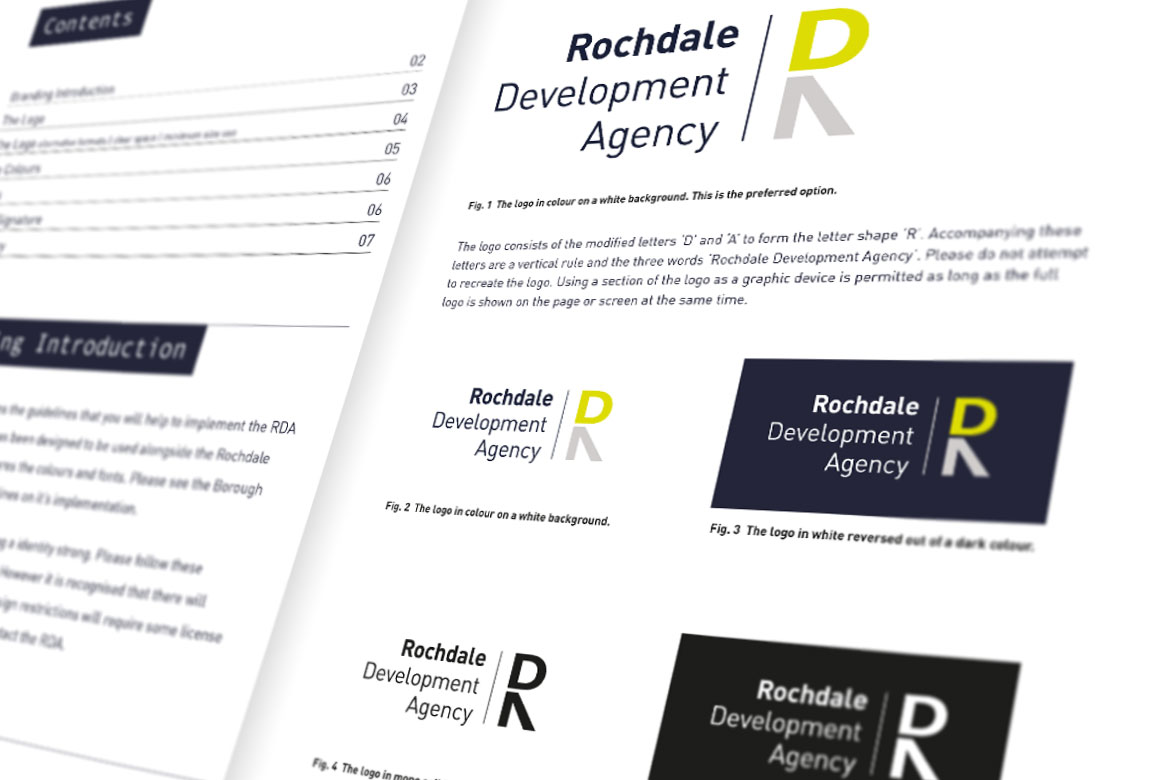
Pages from the RDA identity guidelines document
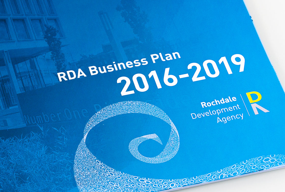
The new logo shown on the cover of the Business Plan featuring the wave graphics from the Borough identity
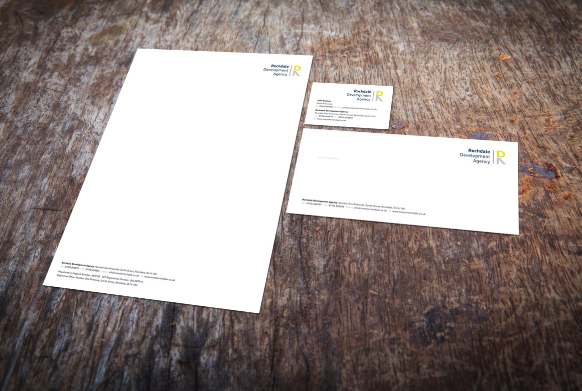
A letterhead, compliment slip and the front of the business card
“Hi Ian, Really pleased with the presentation the other evening & work behind it.”


