I was asked by the Rochdale development Agency if I could assist with the design of a feature exterior sign for the Kingsway Business Park. Happy to oblige, the first stage was to establish expectations regarding size, expense and complexity. I suggested that some initial designs should be created with the preferred design being mocked up to show how it would look when completed.
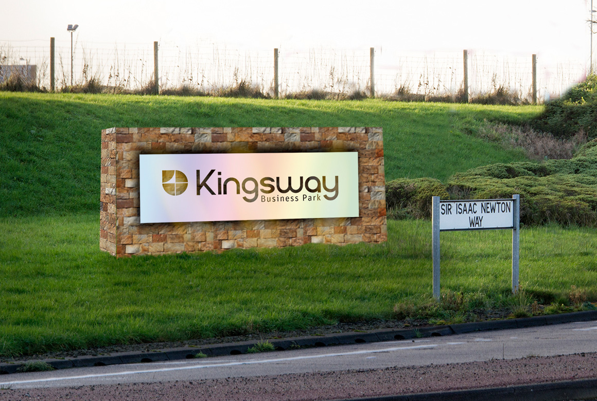
A Photoshop visual to show how the sign could look.
A visual to submit to planning
Once initial designs were reviewed and a favourite selected, I set about producing a visual for use in an outline planning application.
Kingsway Business Park is a tribute to those involved in its design and planning. Throughout the business park there are wide open access roads with tree lined paths. On roundabouts and other traffic islands there are maturing grasses and impressive landscaping.
I visited the site to take some photographs of where the sign would be located. Once I had these, I started to mock up a visual of how it could look. My initial sketches featured a solid and textured stone wall section which is representative of the local stonewalls found in the Pennines. Then a sleek and modern metal facia was added to represent the reflective steel and aluminium modern unit structures already built on the park.
The next stage in creating the artist’s impression was to import the vectored file business park logo and generate a brushed steel metal effect for the metal panel. Once this was complete I added the random sand stone texture from an image I had taken previously. The stone was then distorted to match the perspective in the location image.
Making it look natural
Once all the elements were in place, the final stage was to add shading, any reflections, and lighting effects. The completed design was then shown to the client who approved it. After that it was submitted to planning and the process of turning the design into reality began. Working closely with WAE Group in Leeds, the design was then processed from screen to three dimensions.
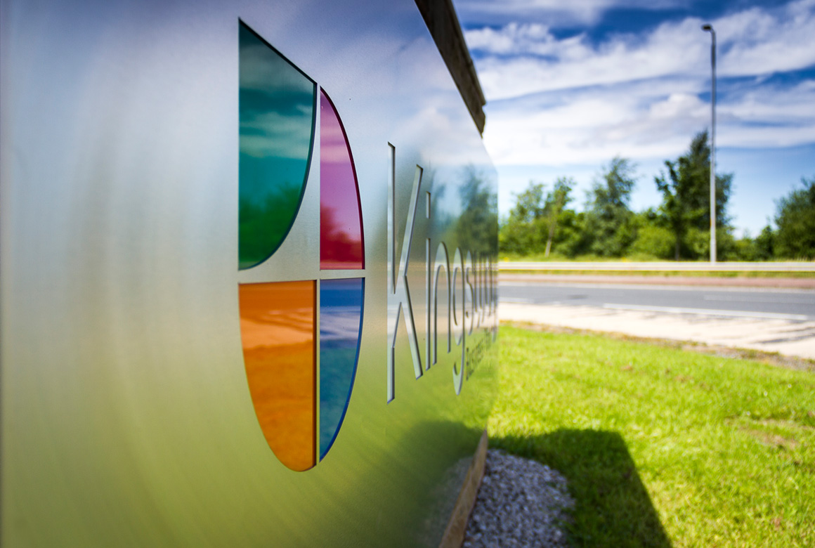
During the final design and artwork stages some enhancements were included. White acrylic lettering and four coloured ‘quarter’ segments were introduced (originally it was intended to cut the logo from the sheet metal and have the aperture back lit). There is now internal lighting as the metal section has more depth.
The final design looks really impressive. And most importantly the client is happy too.
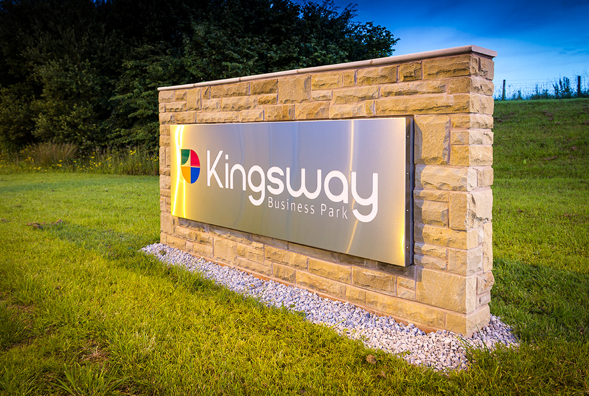
The exterior feature sign in place and looking resplendent.
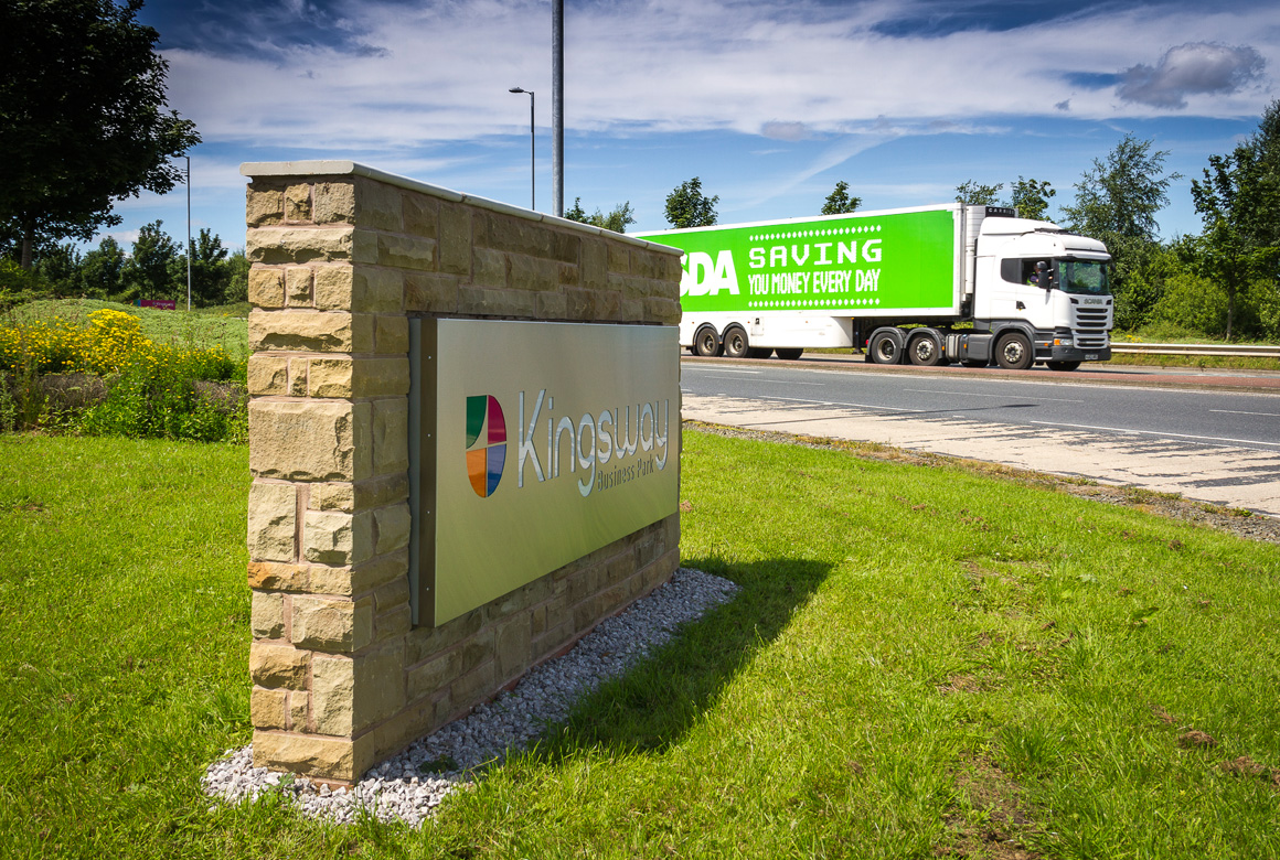
The Kingsway Business Park sign in daylight reflecting the surroundings.



Leave A Comment